

boxed // app refresh // iOS + android design system
UI Development
Wireframing
Documentation
Company:BOXED
Year:2023
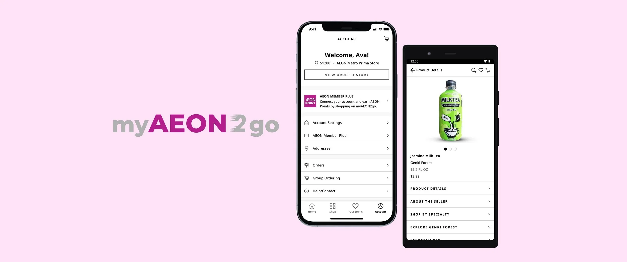
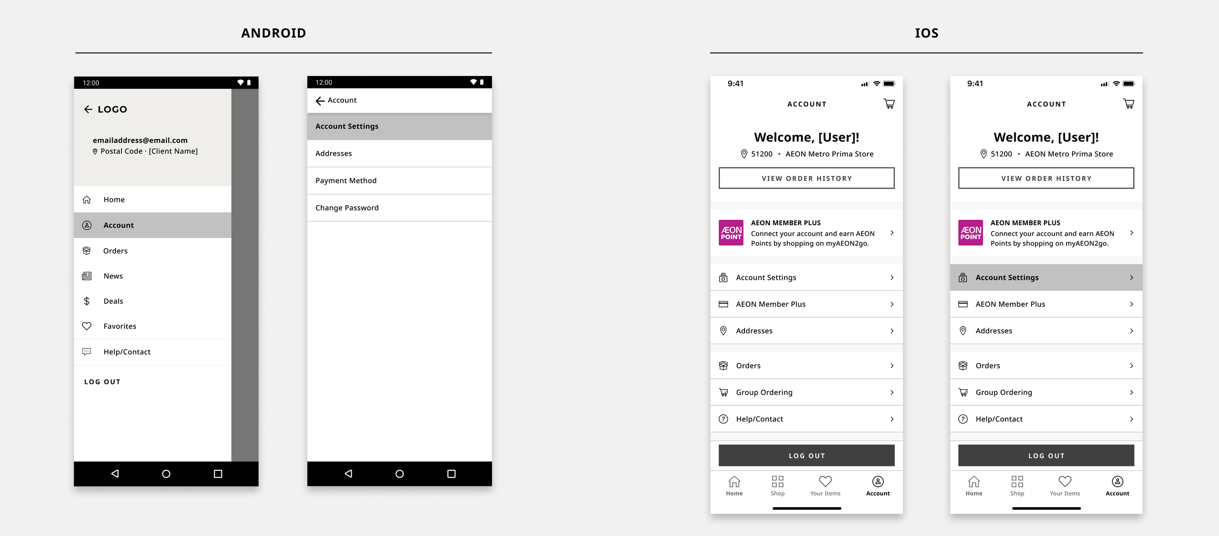
Skills:Aeon MY , a leading Malaysian retail and property management enterprise, runs shopping malls, member rewards, financial services, and the e-commerce platform myAEON2go. Using the Boxed web/app platform, the goal was to streamline deployment and maintenance of native apps for new enterprise clients. To support this, a scalable design system was built to guide future projects and ensure consistent, efficient implementation across web and mobile.I collaborated on the design for Android+IOS platforms and web templates, conducting visual audits and providing extensive documentation for the engineering team to ensure proper implementation.>> Designed scalable, cross-platform experiences, powering seamless enterprise rollout.
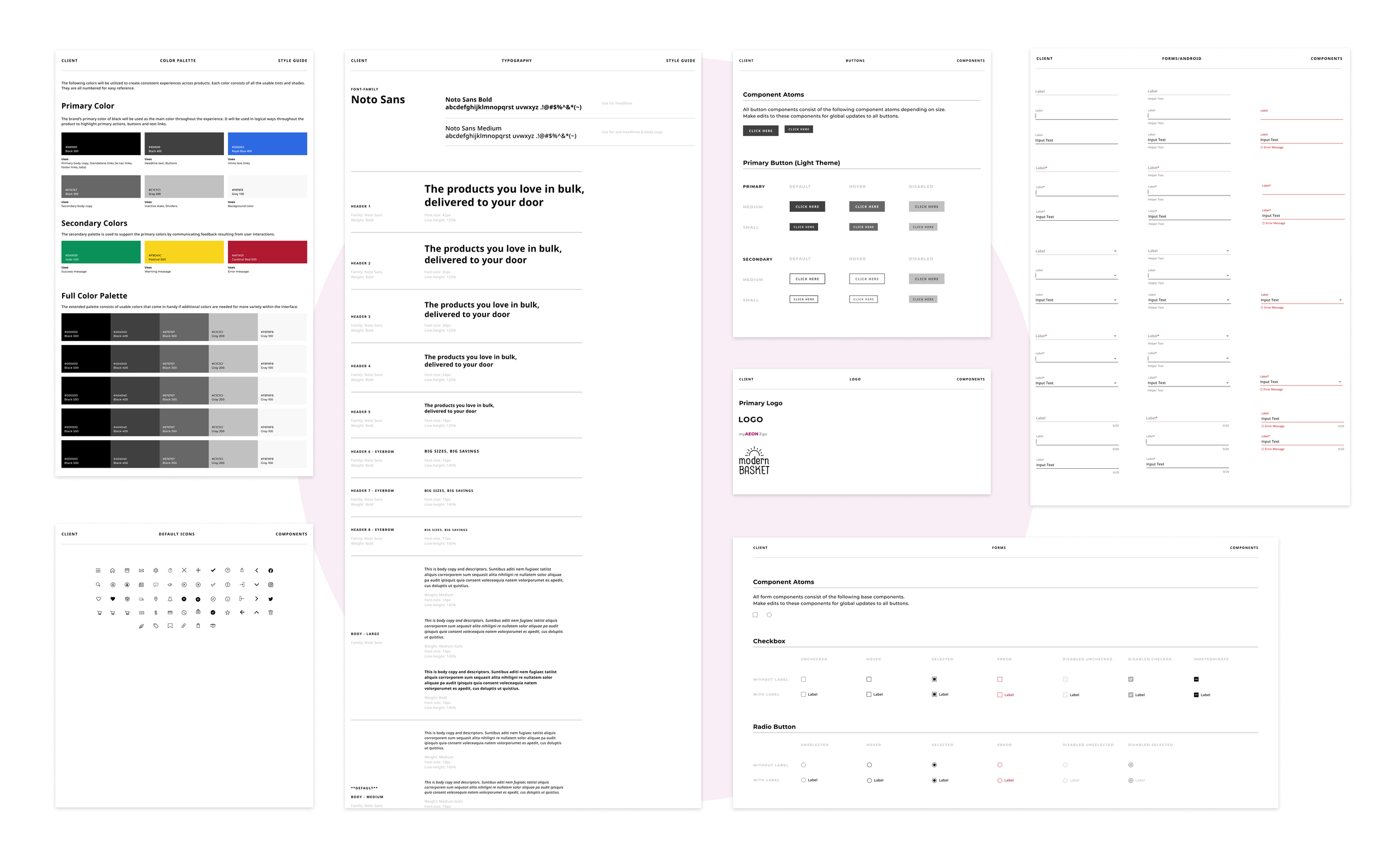
>> Standardize First. Scale Everything.
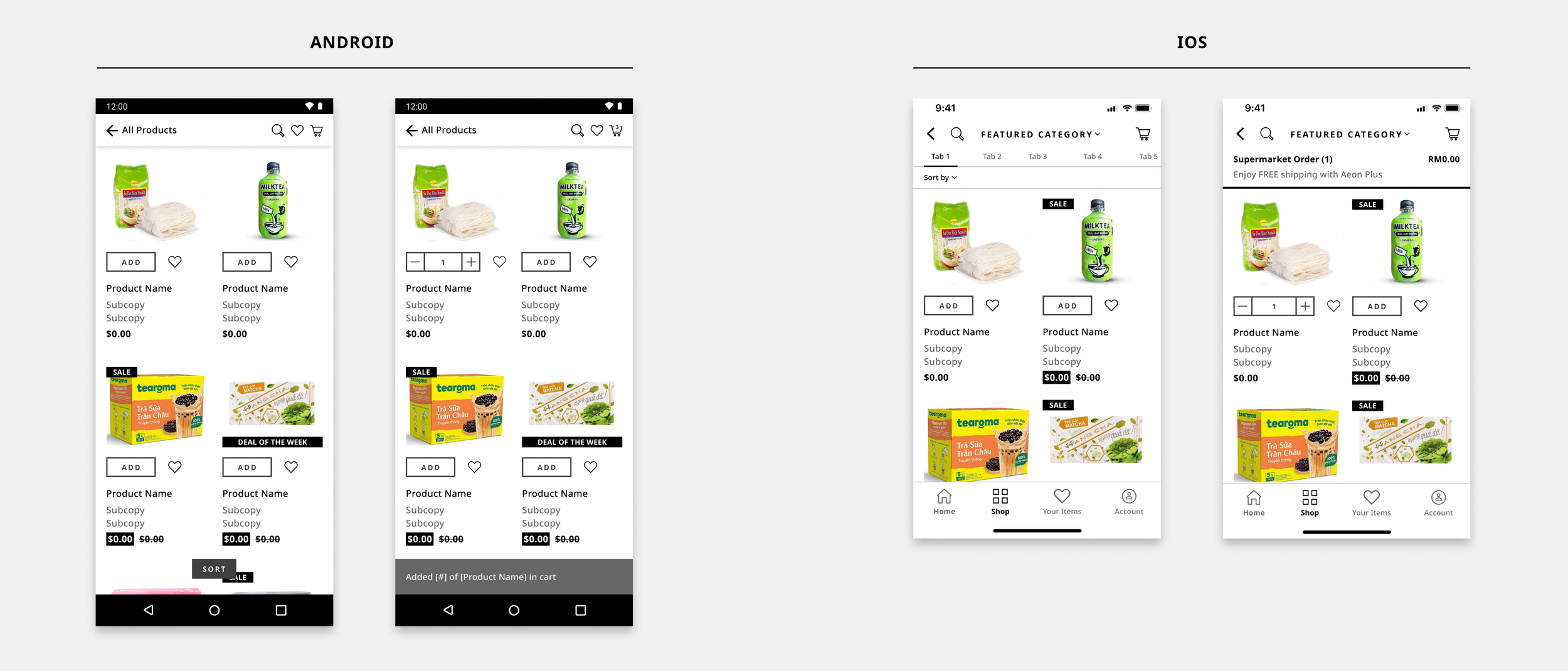
A phased approach aligned brand standards, components, and screens into a single, flexible system ensuring consistency today while enabling global scale tomorrow.PLP (Product Landing Page)
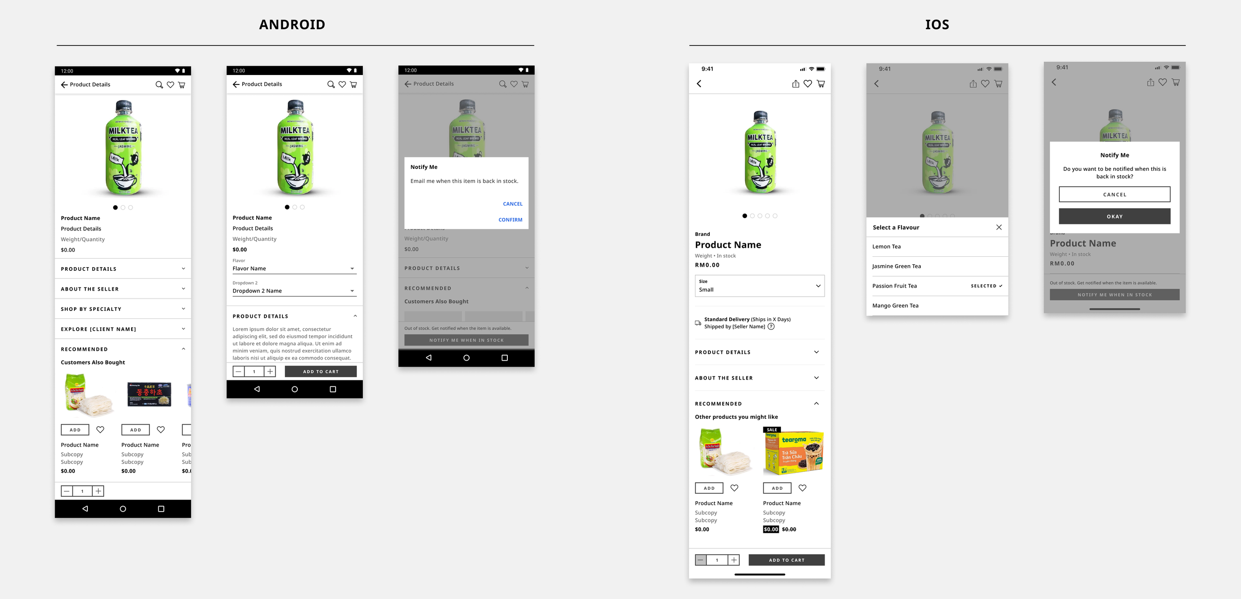
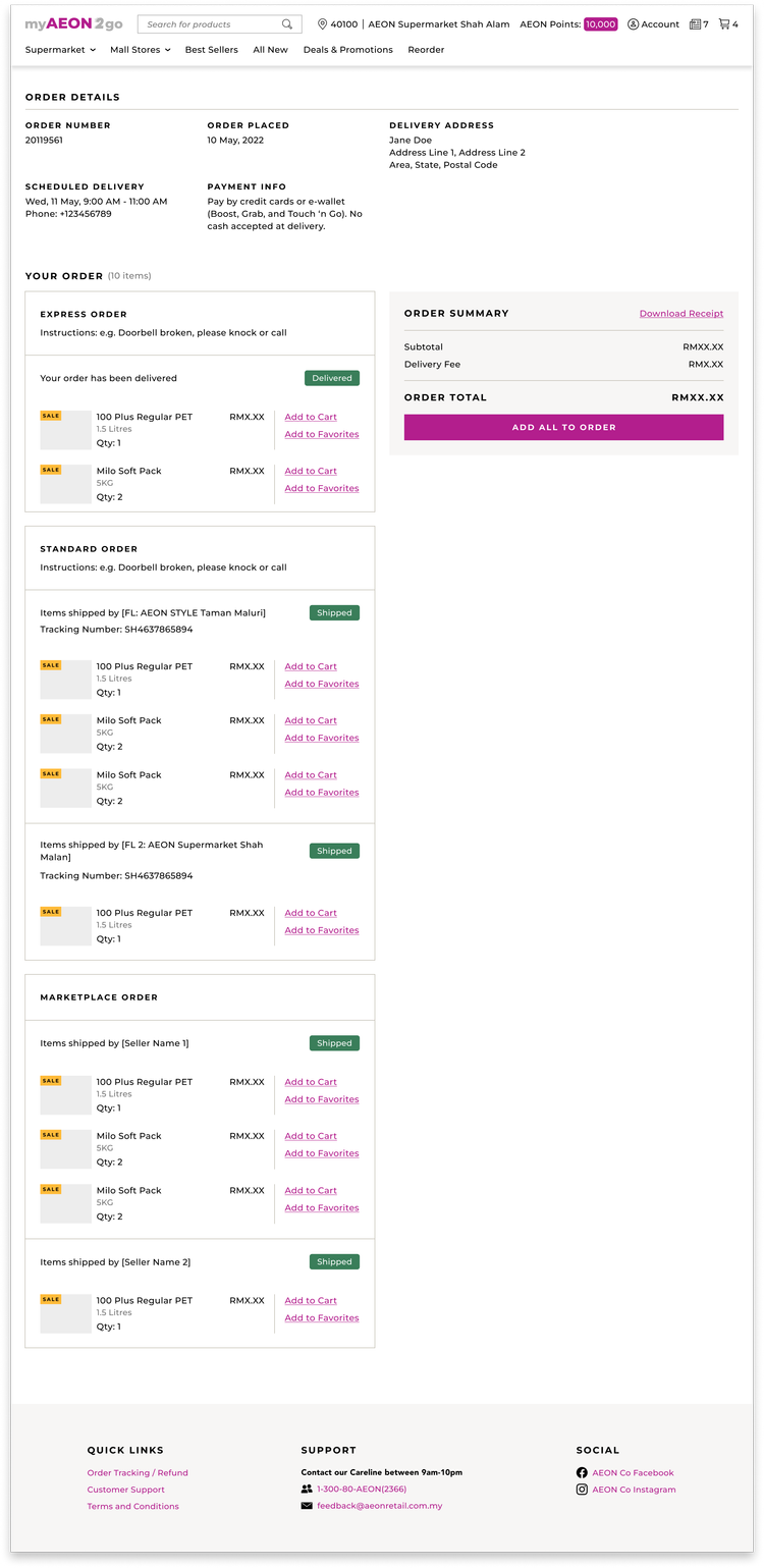
PDP (Product Description Page)
Navigation
>> Checkout Wasn’t Built for Enterprise Reality.
A consumer-style checkout couldn’t support enterprise fulfillment needs, turning a critical flow into a conversion blocker. What surfaced as a request for more shipping options revealed a deeper need: enterprise teams needed checkout to adapt to how their operations actually work, not force them into a single flow.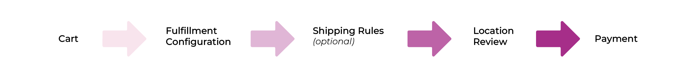
>> Smart Checkout, Seamless Experience.
The reimagined checkout for enterprise workflows added flexibility without overcomplicating the experience. This explored modular fulfillment and location-based review, laying groundwork for scalable, user-focused flows despite project pause.